

Kuna
Packaging, Graphic Design
KUNA creates clothes of highest quality and merges the world of textures and colours to develop a unique and captivating contemporary style.
KUNA takes the inspiration from the magic and art of millenary Peruvian textiles and transforms its garments through skilled designer hands into an avant-garde proposal. This ancient tradition, together with the application of state-of-the-art technology and a fashion forward design point of view, helps KUNA to constantly go above and beyond merely satisfying its customers.


Six degrees of separation
KUNA is committed to the preservation of the environment, the Andean communities and their knowledge and culture.For that reason the packaging design should be environmentally friendly, but also a representation of a very colourful textile tradition and the natural colors of the camelid fibres.
Make it stackable
Besides Perú, KUNA has stores in many countries in the world, where they sell the Milenium collection.
KUNA wanted to have a packaging system that would be easy to transport to every store they have.
They also needed a packaging system easy to stack and keep in the stores without compromising the space.
Make it last
70% of KUNA’s clients in the Peruvian stores are tourists, that means they are going to travel with the products back home.
KUNA needed a packaging system strong enough to endure a trip in a suitcase, without losing its initial shape.

Preserving the culture and the environment
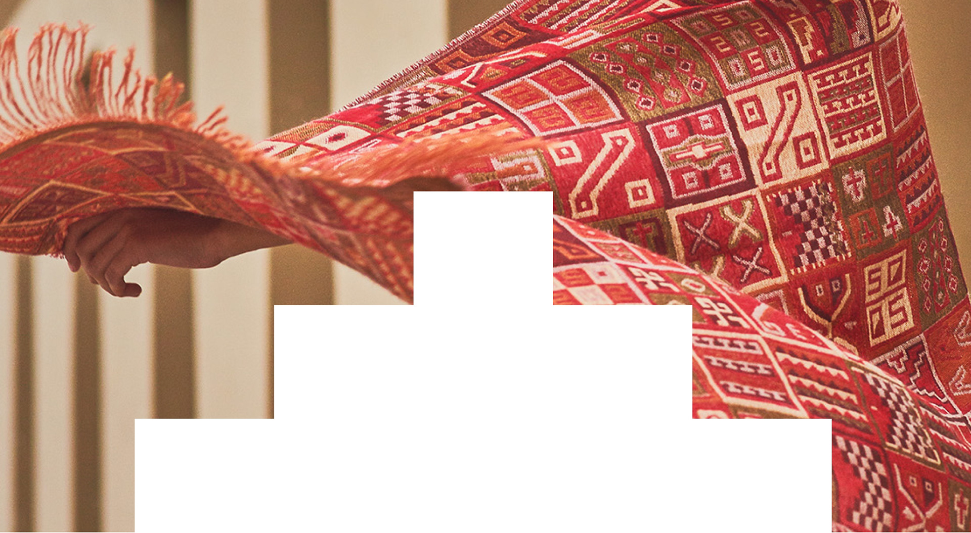
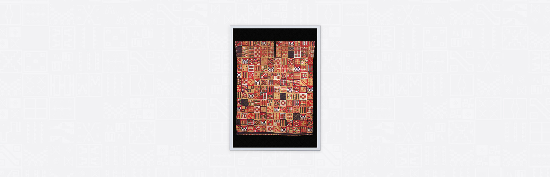
My proposal for the design of the new packaging of KUNA Milenium, was based on the Inca loom shown in the image on the right.
I decided to work with this loom for several reasons:
• The amount of design elements or graphics attracts our attention and invites us to investigate one by one.
• The geometric figures represented, are seen throughout all previous cultures.
• The arrangement of the figures in a kind of perfect grid generates order and cleanliness in the design.
• This design has already been used for the manufacture of garments and it is one of the most significant and important in the textile culture of Peru.
The colours on the original bloom were changed to be the ones used by KUNA. In order to carry out this task, each graphic representation had to be drawn using Adobe Illustrator.
I proposed to use recycled paper, not only to be more environmentally friendly, but also to create the feeling of the Andean landscape as well as utilising the vicuna and alpaca fibre tones of colour.
Several tests were made in terms of color and size of the graphics, to make sure that it can be represented in the proposed material and that it has the appropriate impact.
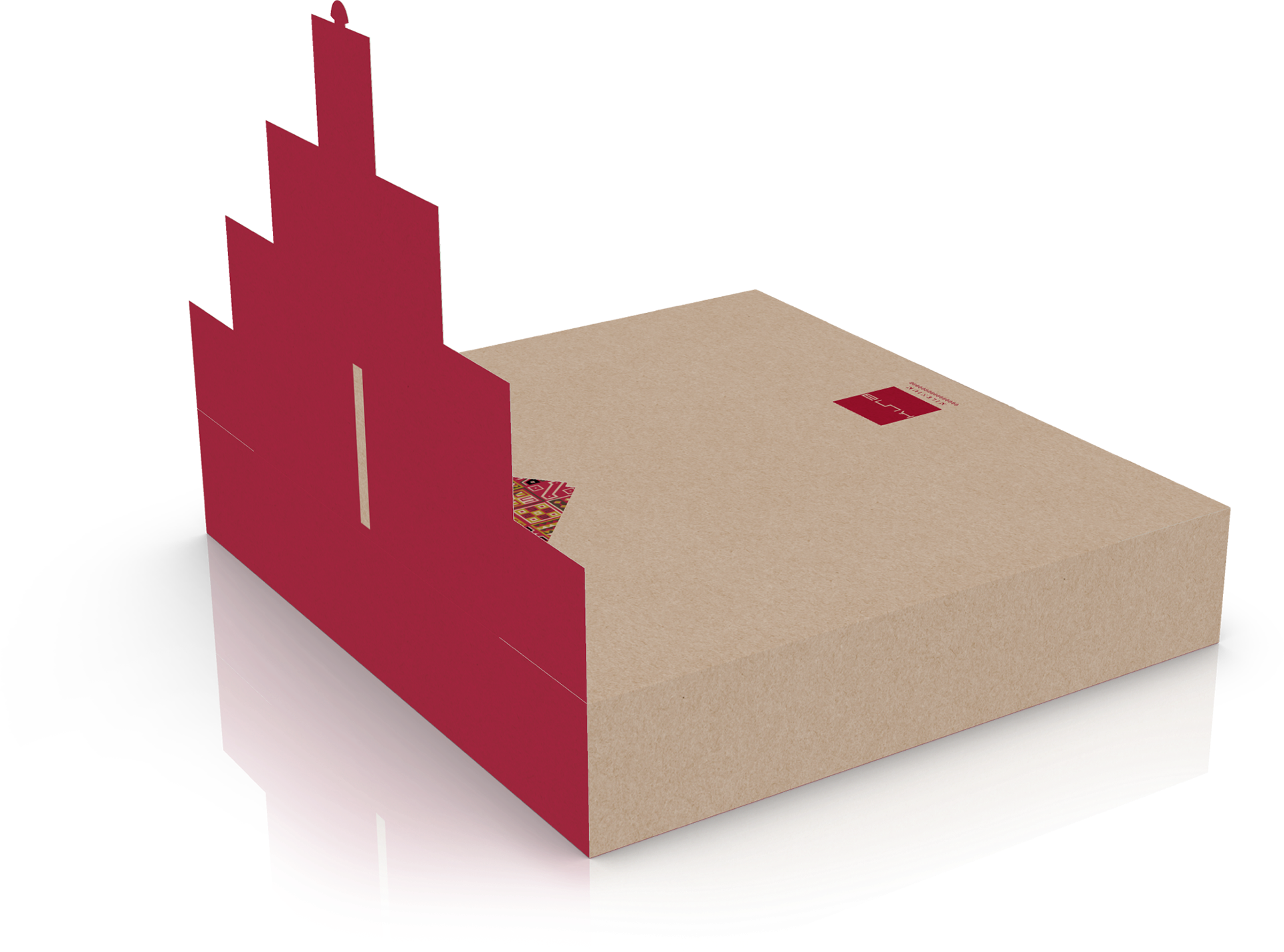
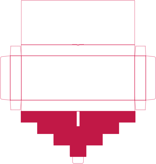
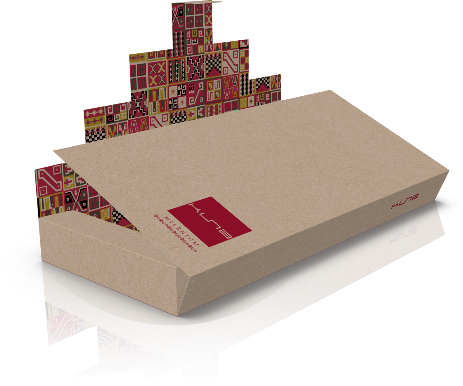
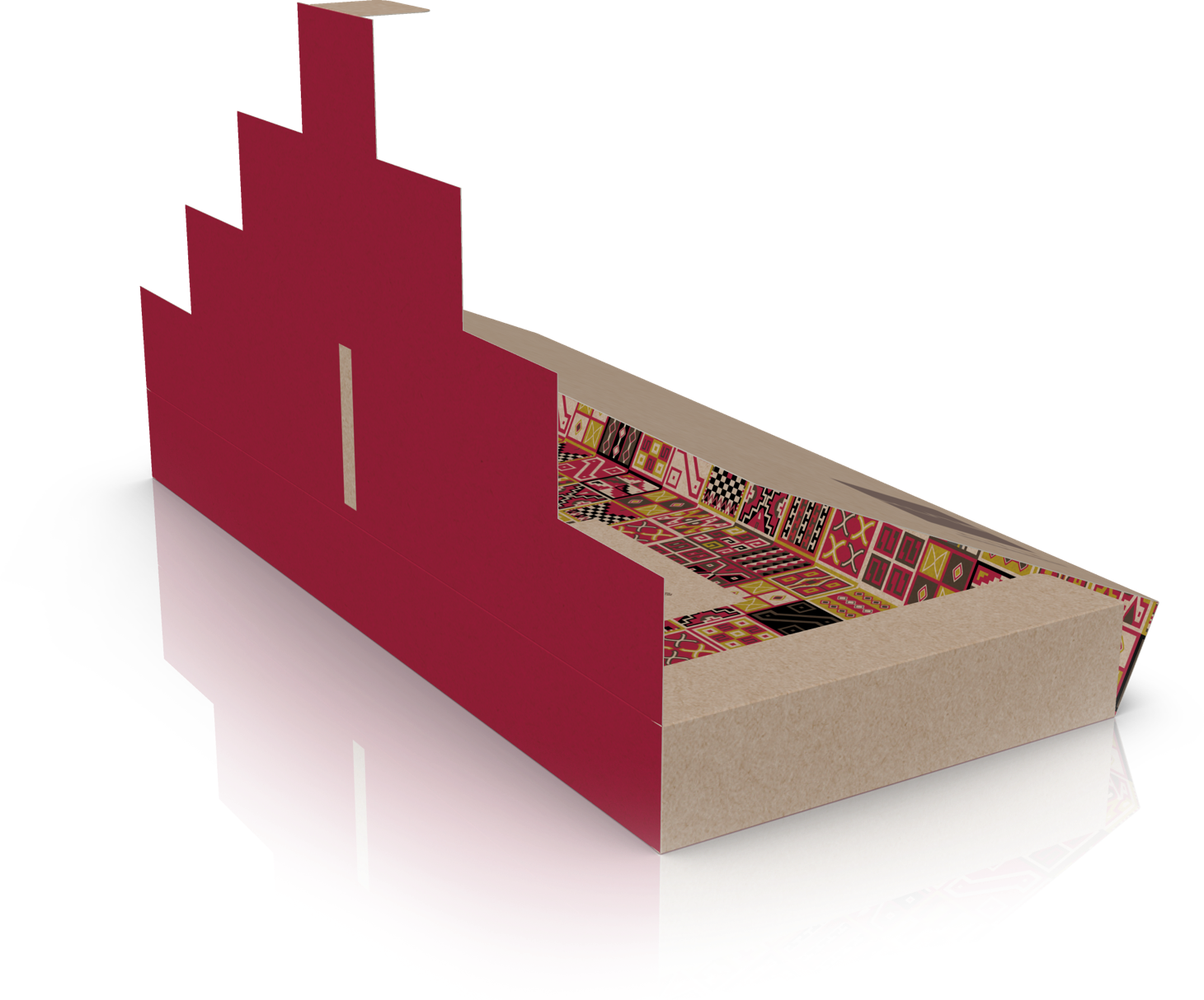
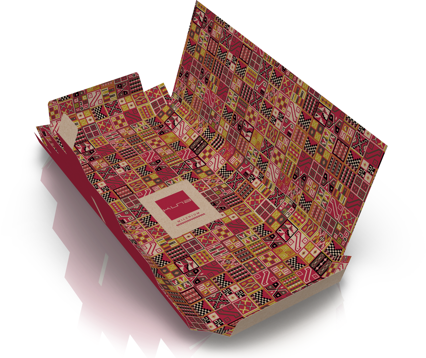
Due to the shape of the KUNA logo, which is elongated, symmetrical and with square lines, we decided to create a packaging shape using as a main element this kind of pyramid or inverted triangle, which we can find in the loom showed above.
This element provides the packaging, the product and the brand, strength, symmetry and the feel of legacy.
Stacking boxes
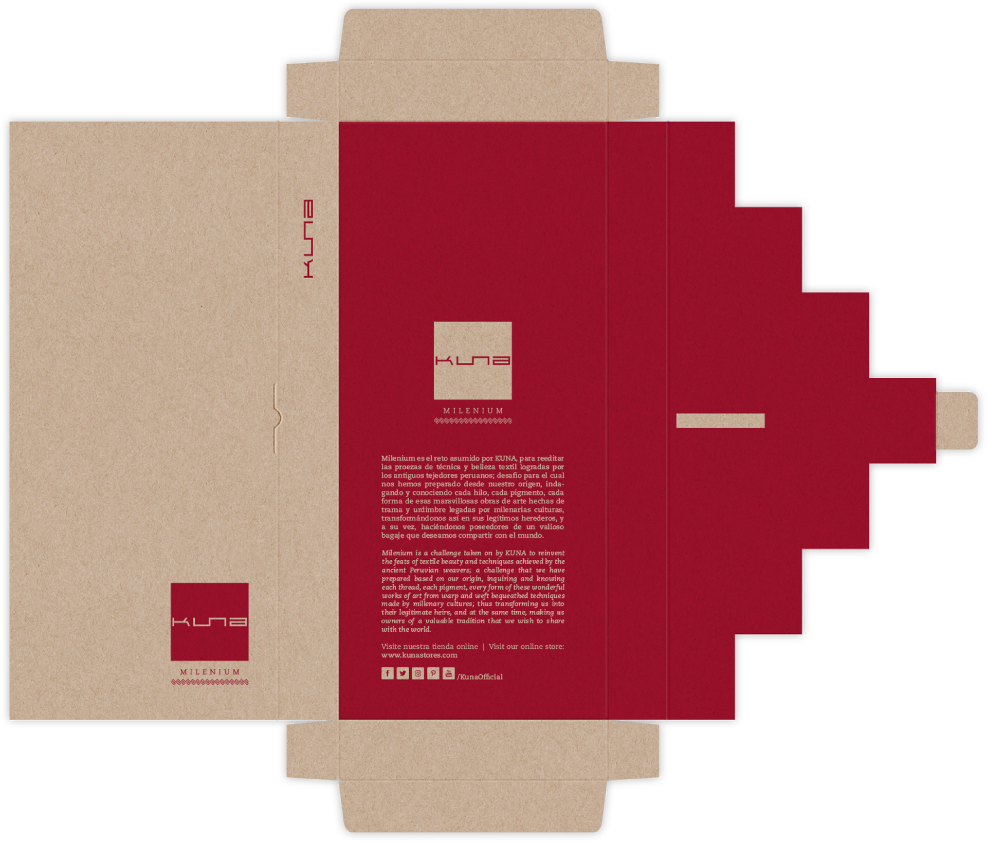
All the packaging systems where designed to make them completely flat while disassemble and make them very easy and fast to assemble.
The long-lasting design
The boxes were design to endure traveling in a suitcase, daily life use and to stay in good shape as a souvenir for some time, all, thanks to the thickness of the selected paper and the proposed layout for constructing the boxes.

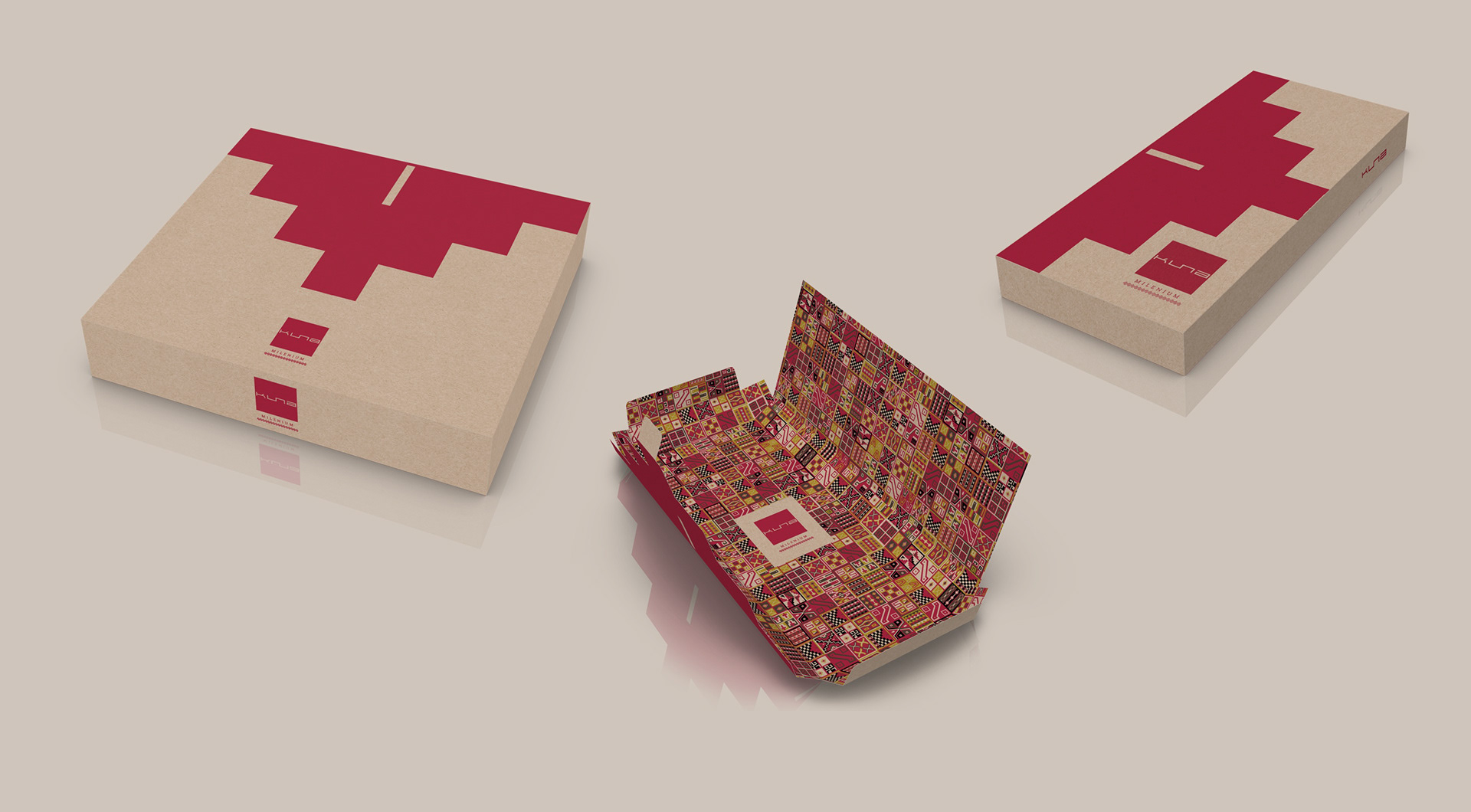
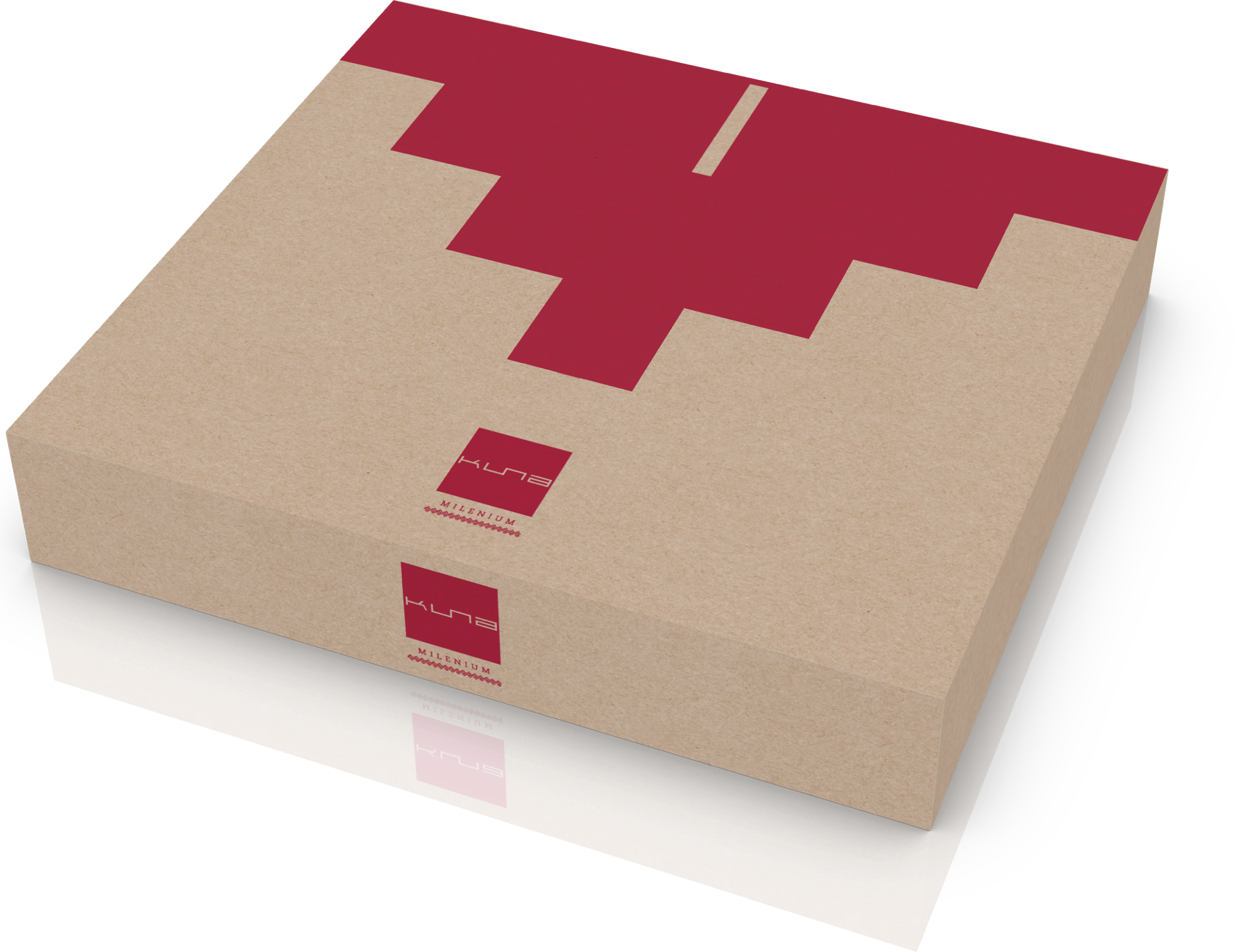
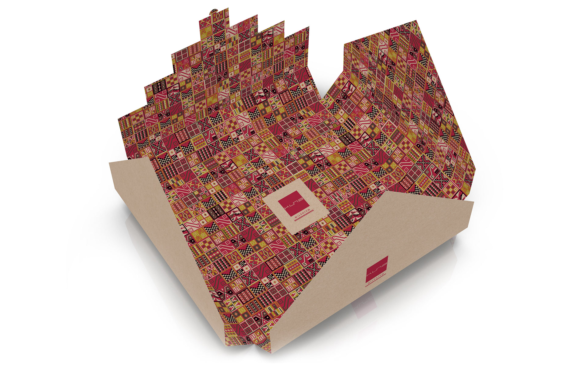
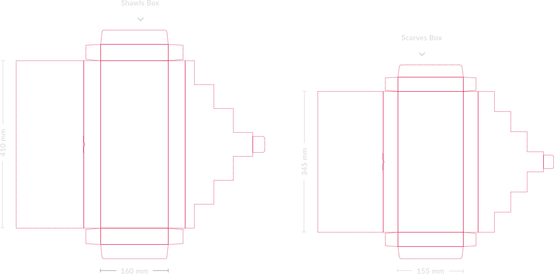
A series of boxes with a very unique layout design and with representative graphic elements, manufactured using recycled thick paper.
Boxes for scarves and shawls
A completely flat and easy to assemble design.
The most important element of the structural design is this pyramid shaped panel.
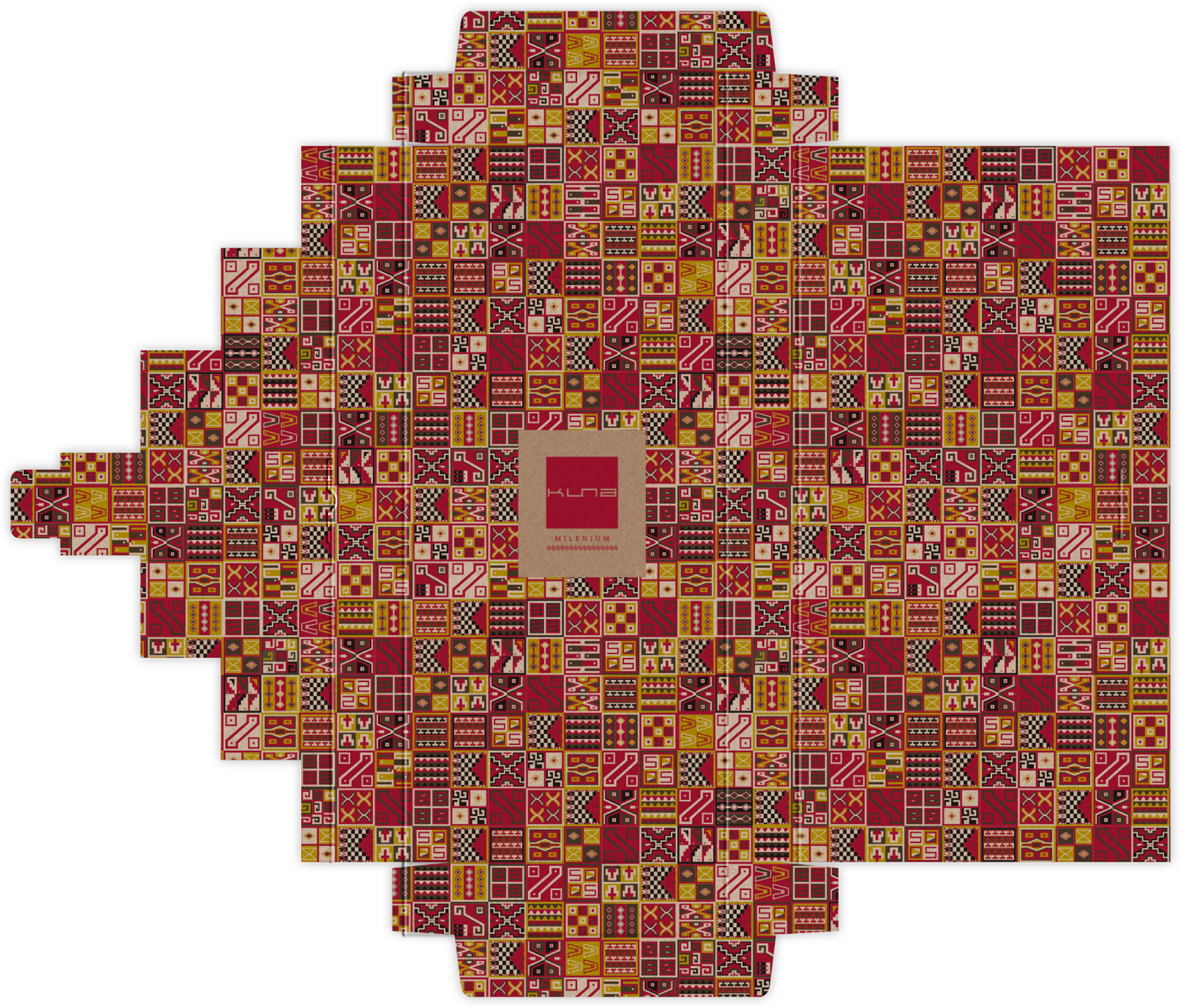
The inside of the box is printed with a pattern based on a very famous inca loom, but specially designed for KUNA, using the brand colors.


Boxes for blankets