

Portugal
Web Design, Graphic Design, UI/UX
Portugal is an international company with more than 150 years of experience in the pharmaceutical and healthcare market. The company produce more than 700 products within health care, cosmetics, vitamins, natural products and sun care.
I was asked by Portugal to redesign their current website, which was divided into a corporate website and an online store.
The new website needed to be more visually appealing, modern, easy to navigate and to manage in-house by untrained people.
Since the previous website was divided into two, it was very hard for the customers to find the right information and products.


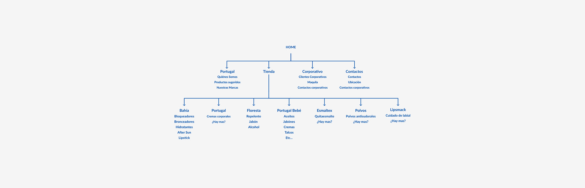
Six degrees of separation
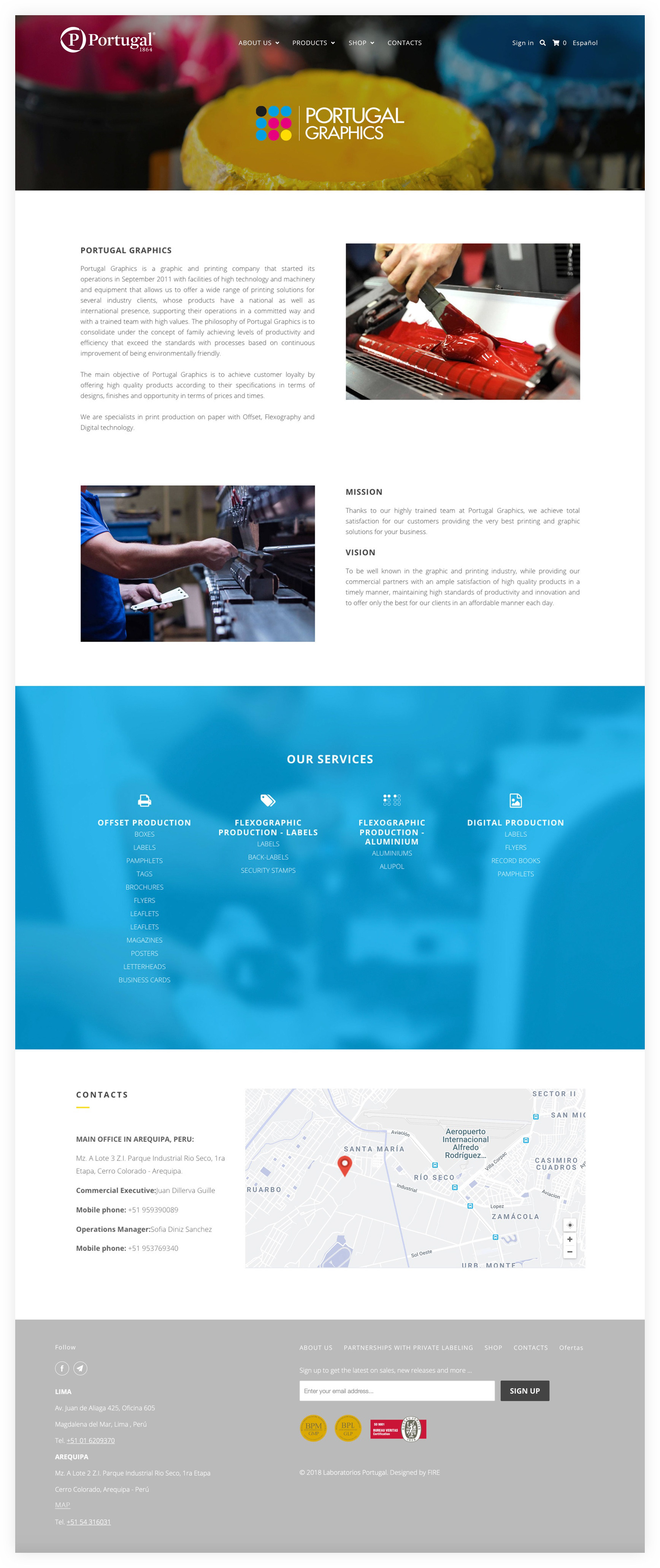
The website needed to target two very different types of clients: B2B and B2C.
Corporate clients interested in doing business mainly through the company’s white labelling and partnerships service.
End-customers interested in purchasing Portugal’s products online.
Corporate clients interested in doing business mainly through the company’s white labelling and partnerships service.
End-customers interested in purchasing Portugal’s products online.
The many pieces puzzle
Most of Portugal’s clients do not know which products are manufactured by the company. The clients only know the products by their brand names.
Portugal wanted to sell more than 350 products within 10 different brand categories online. Each brand with many different products, and some even within the same product category.
Portugal wanted to sell more than 350 products within 10 different brand categories online. Each brand with many different products, and some even within the same product category.
The CMS hypothesis
Portugal needed a website where the company is able to control all design and content aspects by themselves, and a website where the company can manage all online sales.


No separation at all
Joining the two websites: The corporate and the online store was a more complicated task than first expected.
The process included many hours of designing navigation maps and user-experience research.
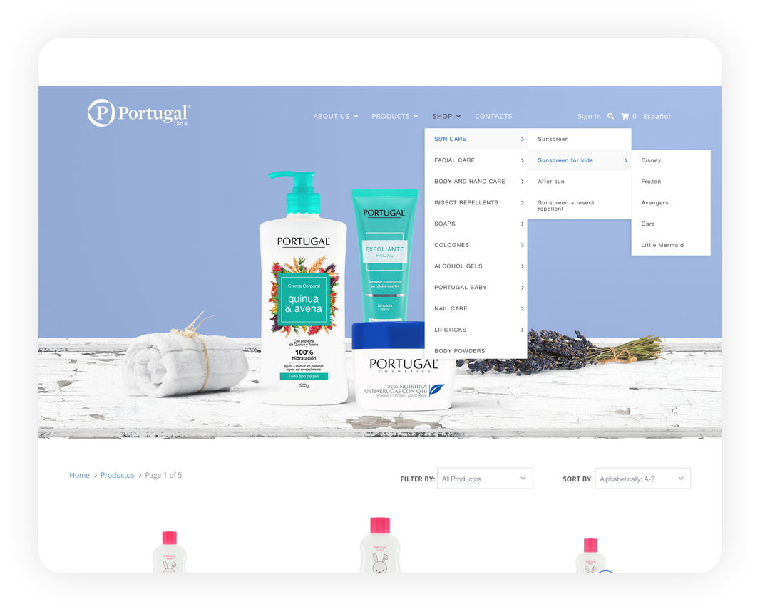
My original proposal was to create a separate button for the cooperative part, but Portugal wanted all information under “About Us”, so I designed a more complex navigation menu - keeping it yet easy to navigate.
Putting the pieces together
Within the 10 brands that Portugal wanted to sell through their website, there were 11 product categories and 350 products in total – quite a puzzle to make!
Some customers would search for a product by its brand, while other would search by category, and that is why I decided to place the brands and the categories in the navigation menu, as well as a category filter on top of the product session.
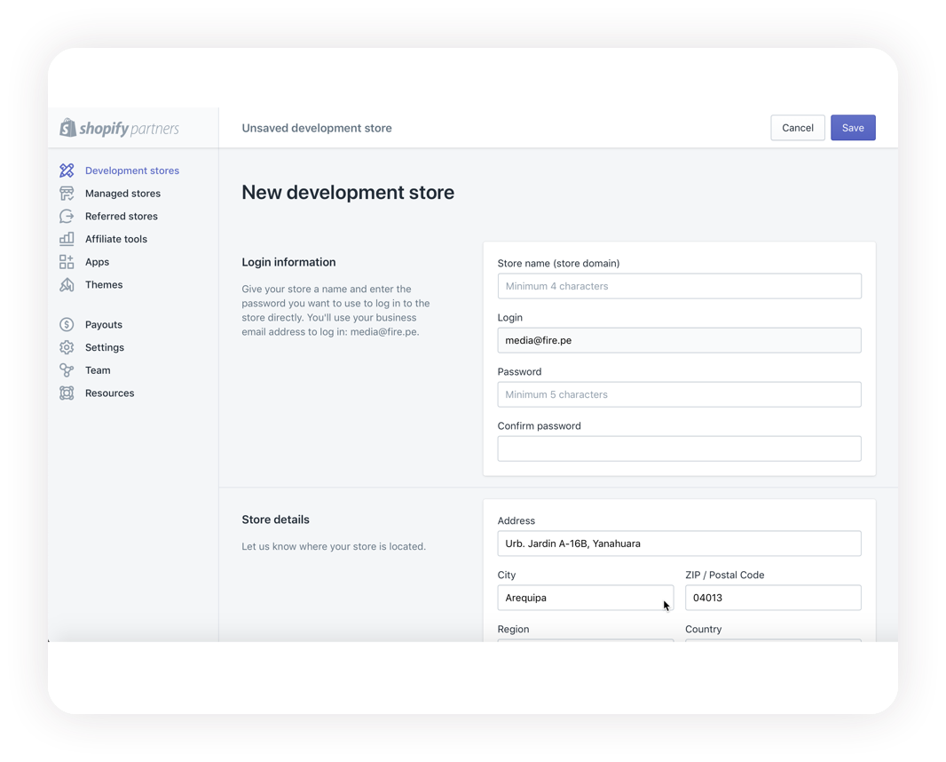
Shopify CMS to the rescue
After a lot of research and due to the website’s many features, we decided to develop the website and e-commerce site using the platform Shopify.
In order to make the website more “CMS-friendly” for Portugal, I decided to instal some additional Shopify apps.
In order to make the website more “CMS-friendly” for Portugal, I decided to instal some additional Shopify apps.
As the website menu was rather complex, I installed a menu builder in order to create design flexibility, a very complete intuitive page builder, a translation service and finally, I set up everything in order for the company to be able to start their online sale and to manage their own store and website.

A responsive e-commerce site developed with Shopify and with extra and very functional add-ons to make sure that the company has complete freedom to manage the site.
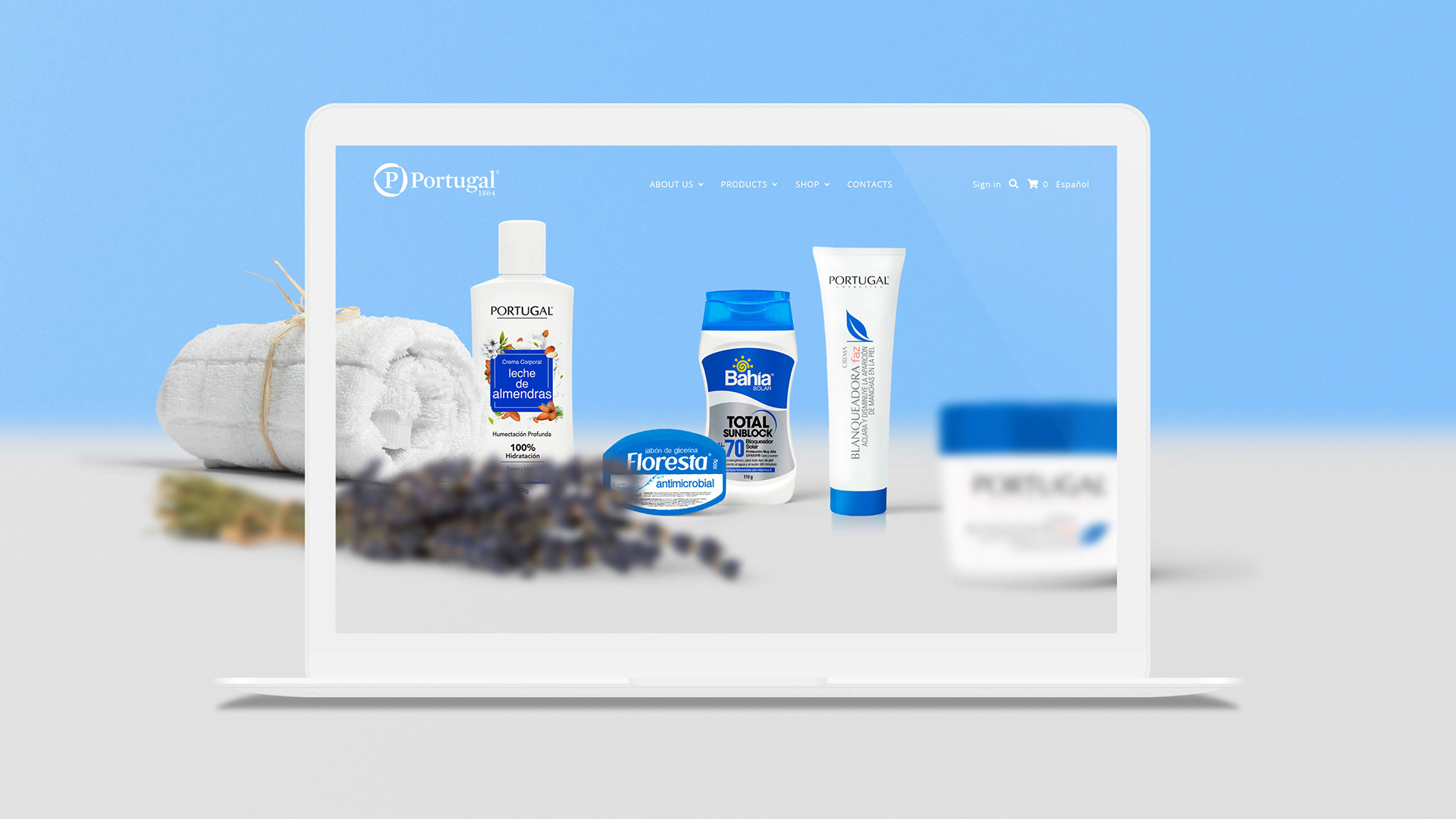
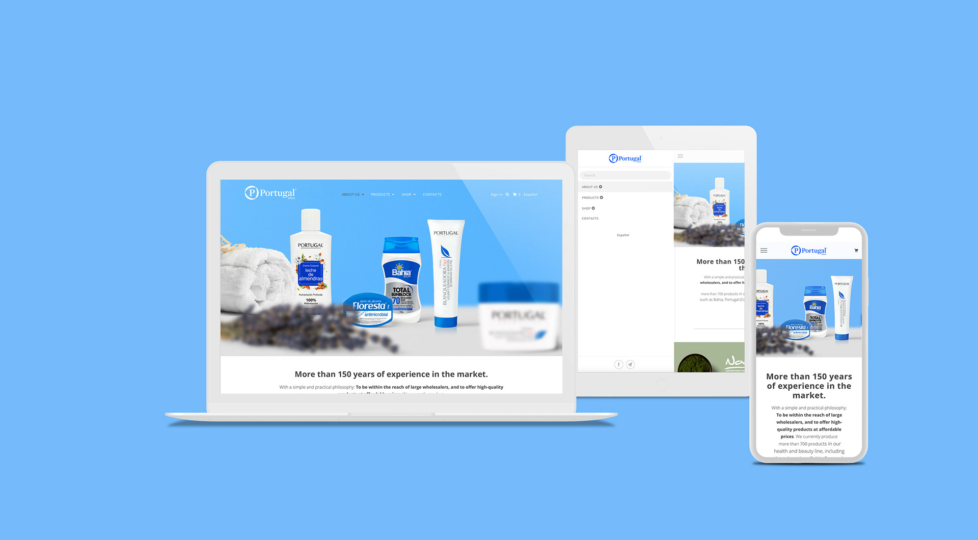
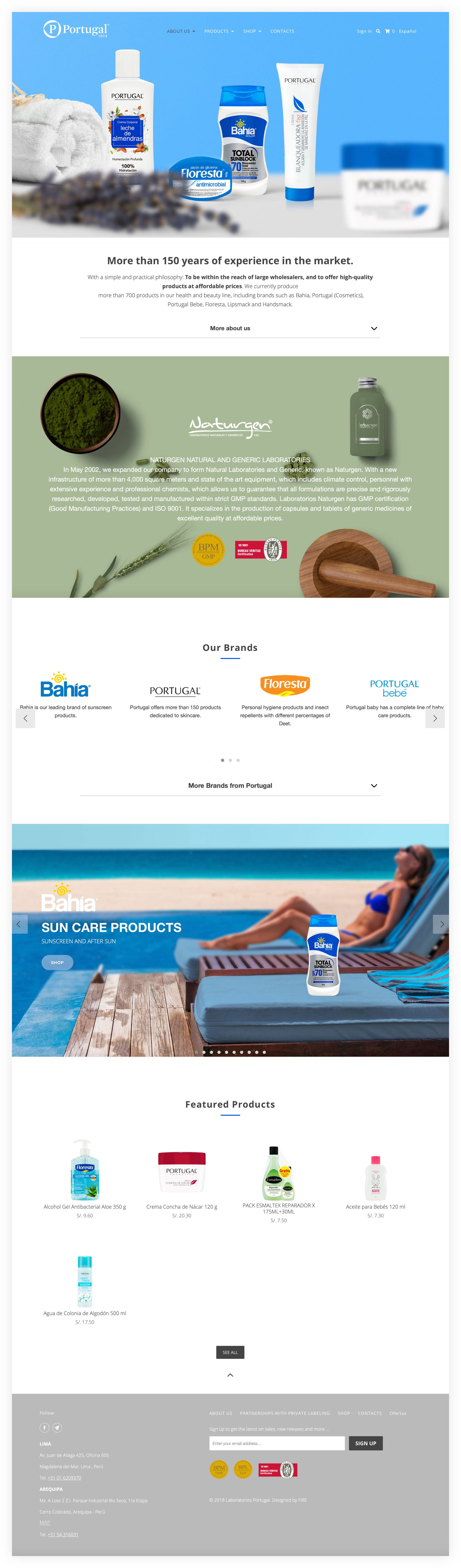
Home Page
The hero images on the website are my designs using the real products.
The parallax images on the website are my designs using the real product.
The hero images on the website are my designs using the real products.
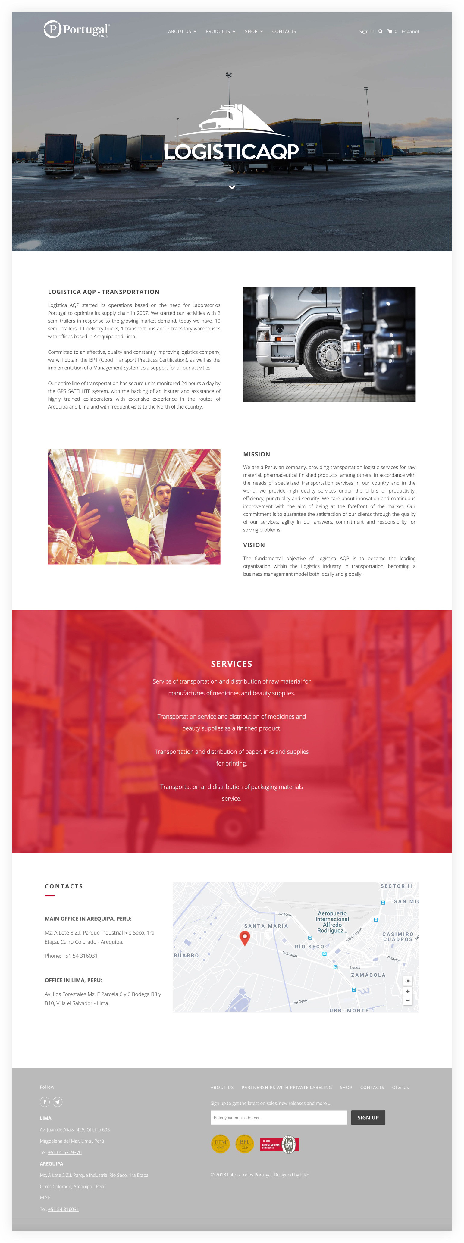
Corporate Pages


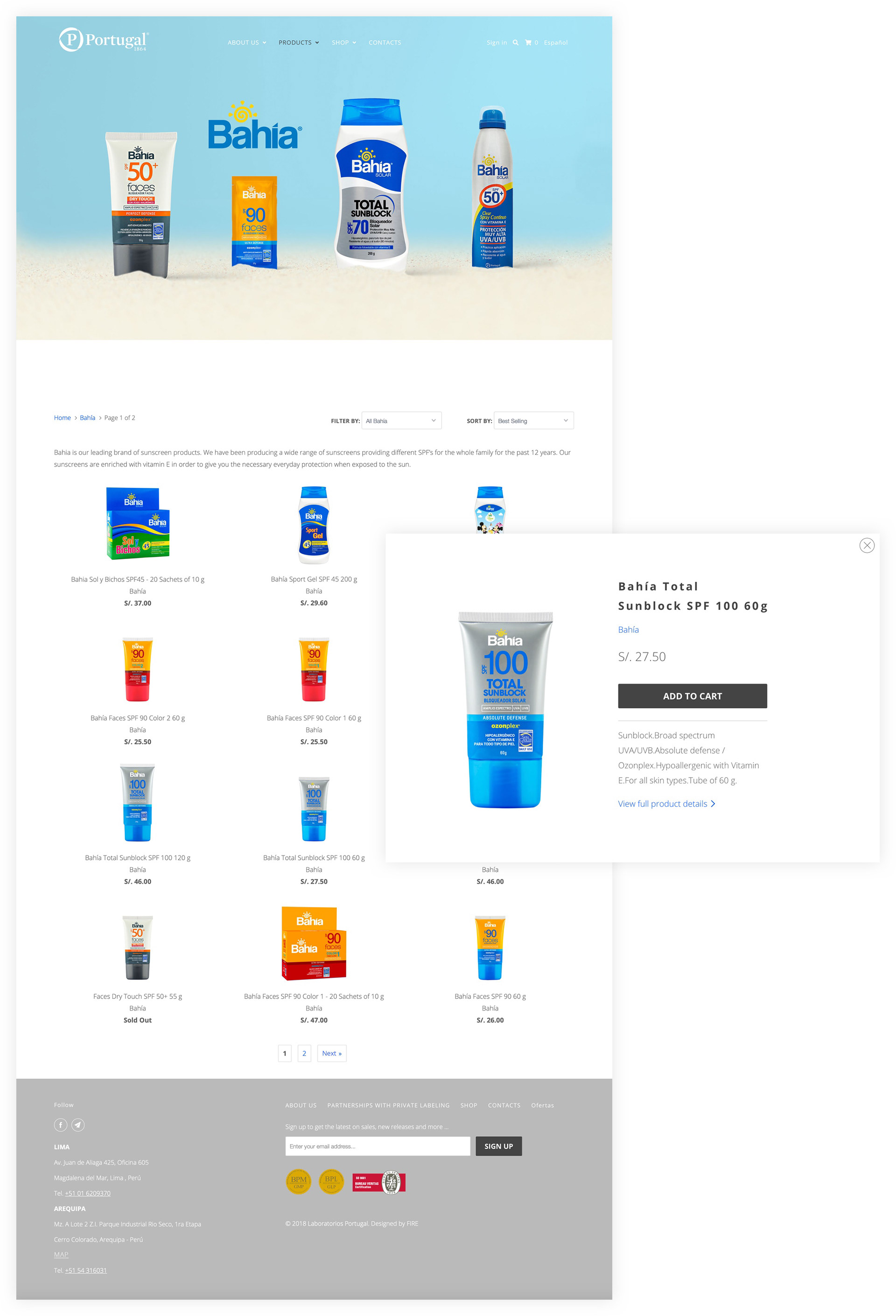
Product Pages
A filter by category function was added in order to make the product search easier and faster.
With a Quick Shop feature to make the purchases easier.